Pure CSS Vaporwave: Creating HYPERPOP's Visual Effects
Pure CSS Vaporwave: Creating HYPERPOP's Visual Effects
While building HYPERPOP, I learned that creating authentic Y2K vaporwave aesthetics is all about layering CSS effects thoughtfully. Here are the actual techniques I used - no JavaScript required, just 1,500+ lines of carefully crafted CSS.
The Color Palette
Start with these essential colors:
:root {
  --neon-purple: #9D00FF;
  --hot-pink: #FF10F0;
  --cyber-blue: #00F0FF;
  --acid-green: #39FF14;
}
These aren't just random neon colors—they're carefully chosen to evoke that nostalgic digital feeling.
Text Effects
Neon Glow
.neon-text {
  color: var(--cyber-blue);
  text-shadow:
    0 0 10px var(--cyber-blue),
    0 0 20px var(--cyber-blue),
    0 0 40px var(--cyber-blue);
}
Chromatic Aberration
.chromatic {
  position: relative;
}

.chromatic::before {
  content: attr(data-text);
  position: absolute;
  text-shadow: -2px 0 #ff00ff;
}

.chromatic::after {
  content: attr(data-text);
  position: absolute;
  text-shadow: 2px 0 #00ffff;
}
Background Effects
Animated Gradients
.gradient-bg {
  background: linear-gradient(
    45deg,
    #9D00FF, #FF10F0, #00F0FF
  );
  background-size: 400% 400%;
  animation: gradient-shift 15s ease infinite;
}

@keyframes gradient-shift {
  0% { background-position: 0% 50%; }
  50% { background-position: 100% 50%; }
  100% { background-position: 0% 50%; }
}
Scan Lines
.scanlines::before {
  content: "";
  position: absolute;
  background: repeating-linear-gradient(
    0deg,
    rgba(0, 0, 0, 0.15) 0px,
    rgba(0, 0, 0, 0.15) 1px,
    transparent 1px,
    transparent 2px
  );
  animation: scanline-move 8s linear infinite;
}
Border Effects
Holographic Borders
.holo-border {
  position: relative;
  border: 2px solid transparent;
}

.holo-border::before {
  content: "";
  position: absolute;
  inset: -2px;
  background: conic-gradient(
    from 0deg,
    #ff00ff, #00ffff, #ffff00,
    #ff00ff
  );
  border-radius: inherit;
  z-index: -1;
  animation: rotate 3s linear infinite;
}

@keyframes rotate {
  100% { transform: rotate(360deg); }
}
Button Styles
Neon Buttons
.neon-button {
  padding: 12px 30px;
  background: transparent;
  border: 2px solid var(--cyber-blue);
  color: var(--cyber-blue);
  position: relative;
  overflow: hidden;
}

.neon-button::before {
  content: "";
  position: absolute;
  background: linear-gradient(
    90deg,
    transparent,
    rgba(0, 240, 255, 0.3),
    transparent
  );
  transition: left 0.5s ease;
}

.neon-button:hover {
  box-shadow:
    0 0 10px var(--cyber-blue),
    0 0 20px var(--cyber-blue);
}
Accessibility Considerations
Always respect user preferences:
@media (prefers-reduced-motion: reduce) {
  * {
    animation-duration: 0.01ms !important;
    transition-duration: 0.01ms !important;
  }
}
Performance Tips
- Use transform and opacity for animations (GPU accelerated)
- Limit animation scope with
will-change - Avoid animating layout properties like width/height
- Use CSS containment when appropriate
Combining Effects
The magic happens when you combine these techniques:
.vaporwave-card {
  background: rgba(30, 30, 30, 0.9);
  border: 2px solid transparent;
  backdrop-filter: blur(10px);
  box-shadow: 0 0 50px rgba(157, 0, 255, 0.3);
}

.vaporwave-card::before {
  /* Holographic border */
}

.vaporwave-card::after {
  /* Scan lines */
}
Real-World Implementation
In HYPERPOP, we combined all these techniques:
- Glitch text on headings for that digital distortion
- Holographic borders on blog post cards
- Scan lines overlaying the entire page
- CRT curvature for that monitor authenticity
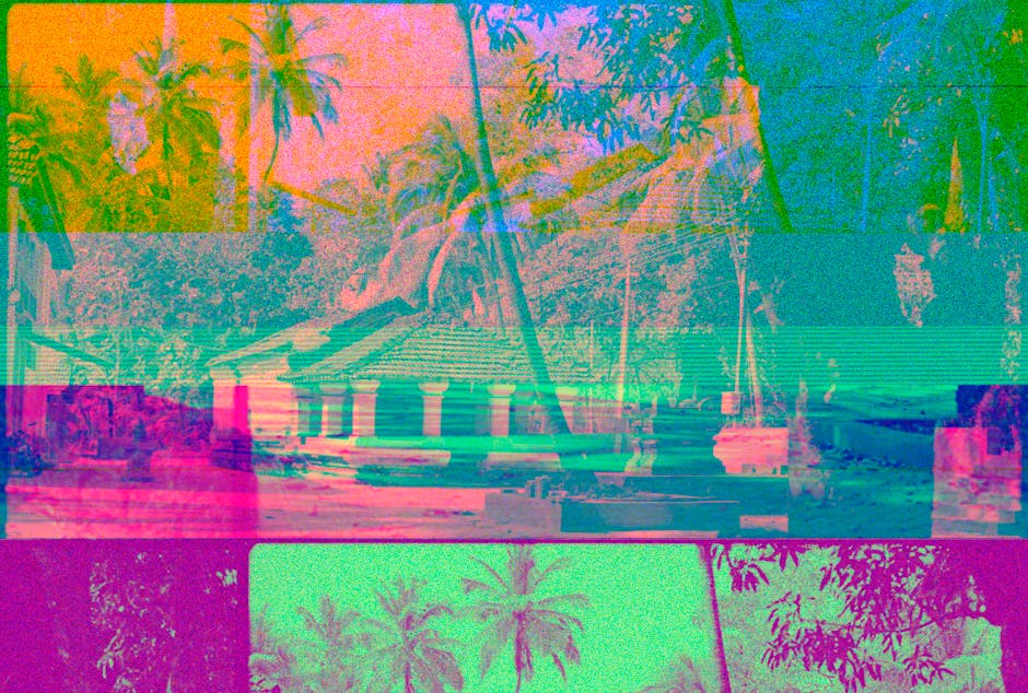
- Image crunching with CSS filters to make modern photos look retro
The result? 1,500+ lines of CSS that create an immersive Y2K experience while maintaining a 90+ Lighthouse performance score.
Lessons Learned
- GPU acceleration is your friend - Use
transformandopacityfor smooth animations - Pseudo-elements are powerful -
::beforeand::afterlet you layer effects without extra markup - CSS filters are underrated -
contrast(),saturate(), andblur()can transform images - Test on real devices - Some effects look different on actual hardware
- Respect user preferences - Always honor
prefers-reduced-motion
Conclusion
Creating authentic vaporwave aesthetics with CSS is about understanding the visual language of Y2K design and translating it to modern web technologies. The techniques in this post power every page of HYPERPOP.
Want to see them in action? Check out the HYPERPOP source code and experiment with your own combinations!
Remember: Effects should enhance, not overwhelm. Let your content breathe.
All code examples are from the actual HYPERPOP theme. Feel free to use and adapt them for your own projects!